Selected work Brand & visual identity
Auren.
A connected visual identity for a business automation platform. From the wordmark to the places people meet the brand.
- Project
- Auren
- Focus
- Identity / Art direction / Brand applications
The work
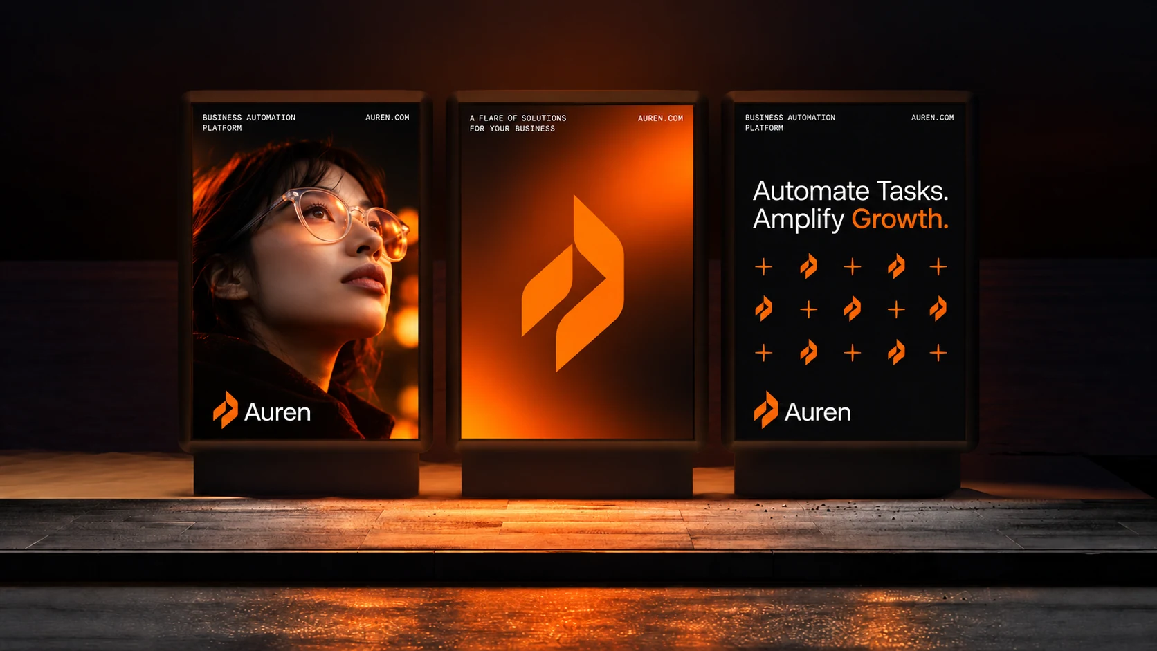
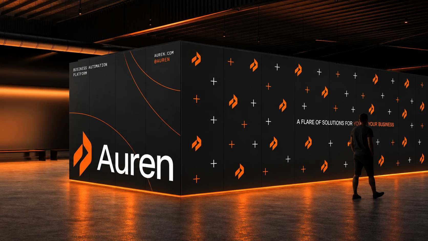
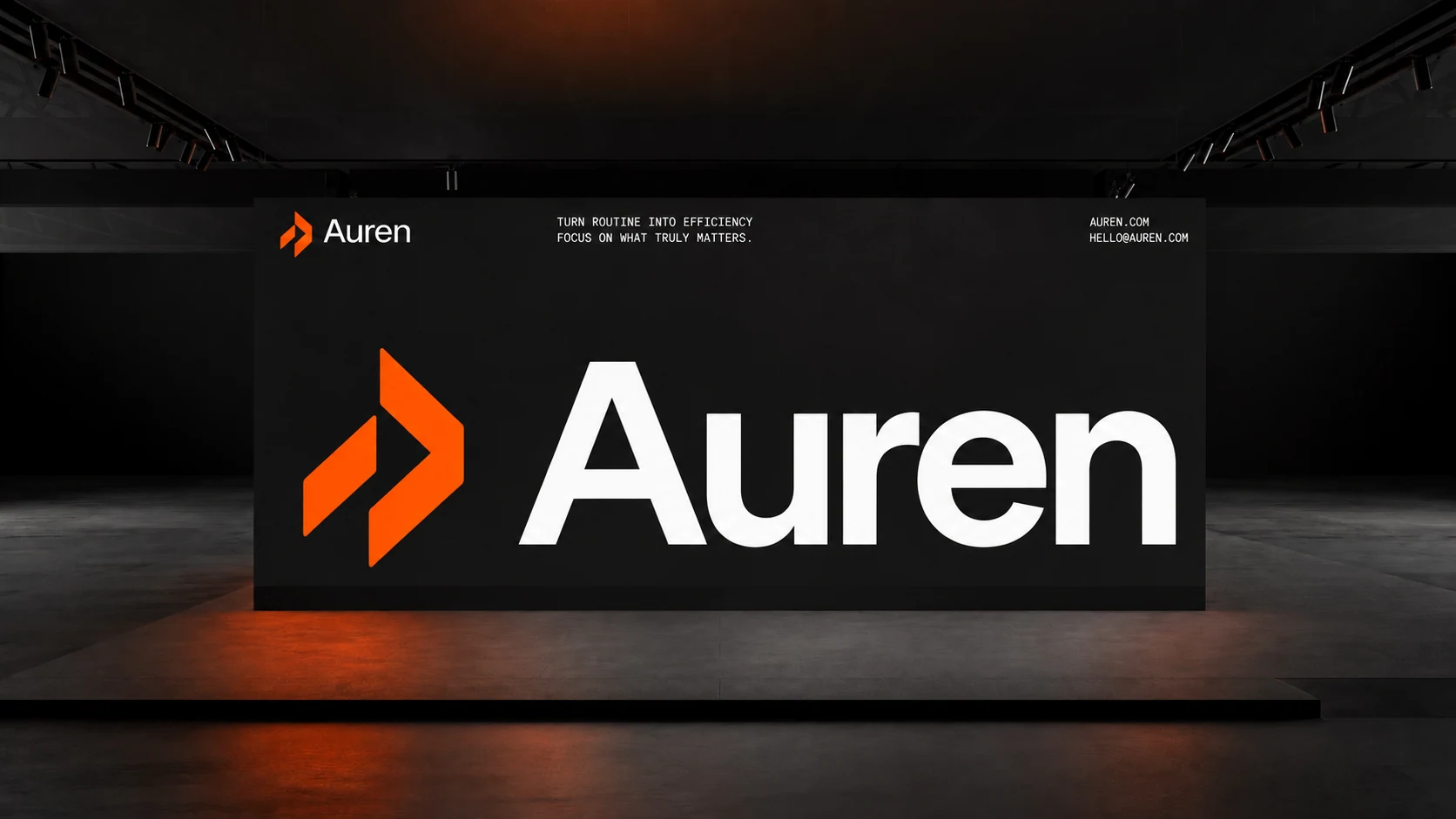
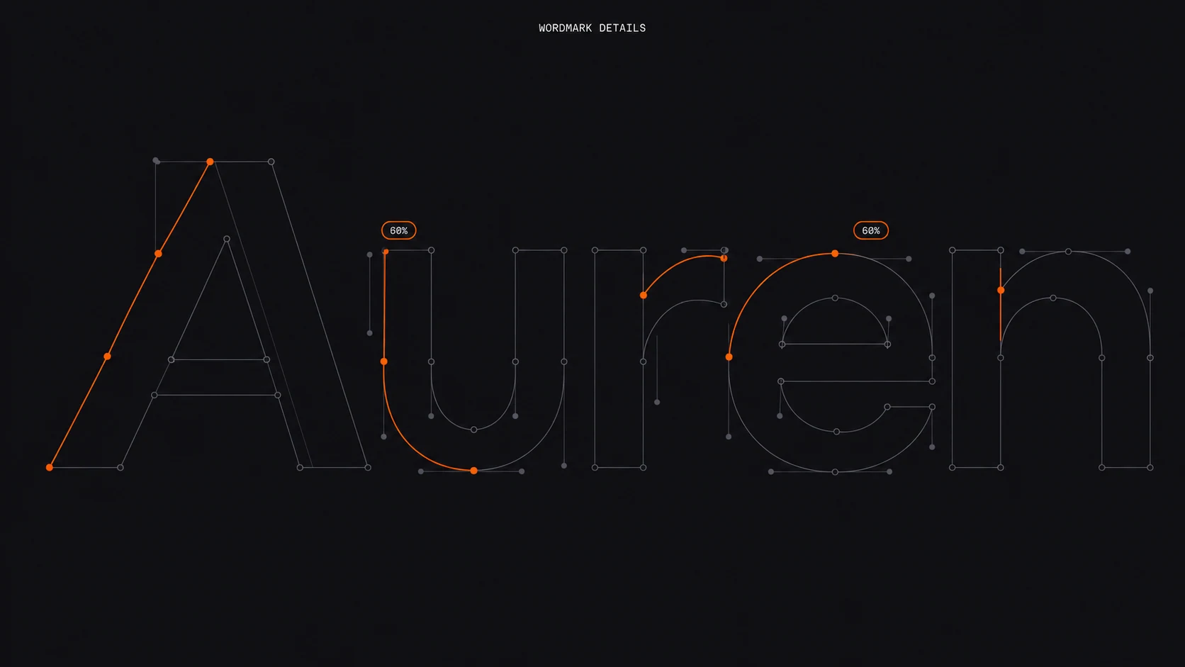
A distinct symbol. A clear wordmark. A visual language that carries through every application.
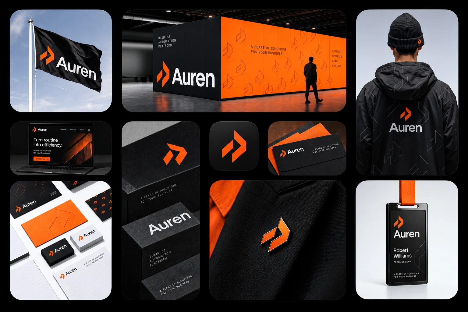
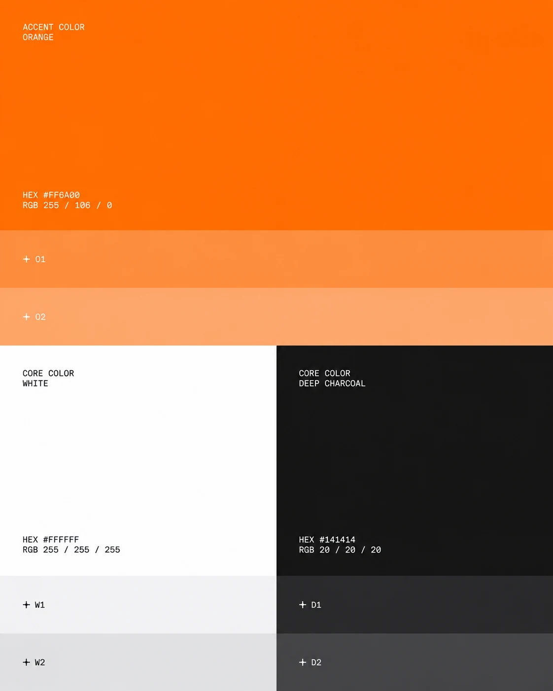
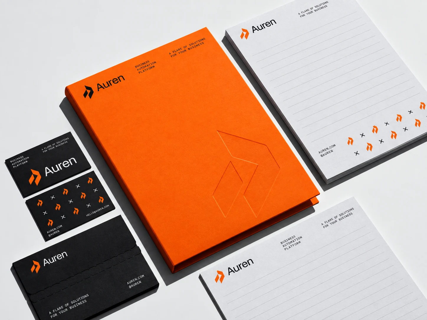
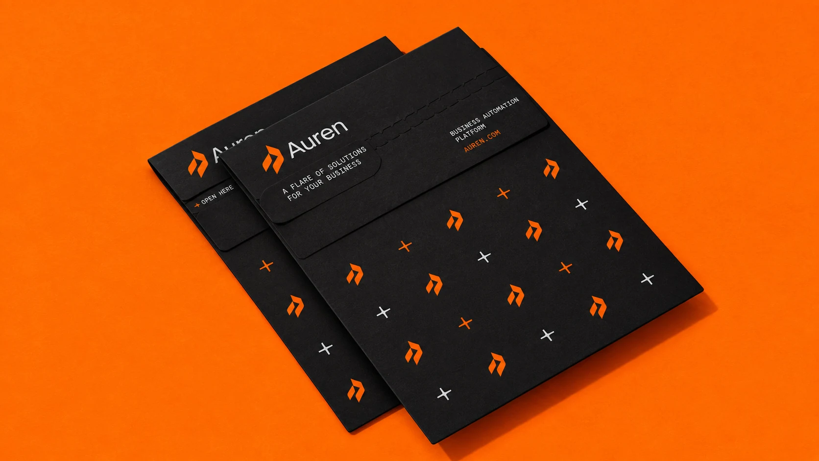
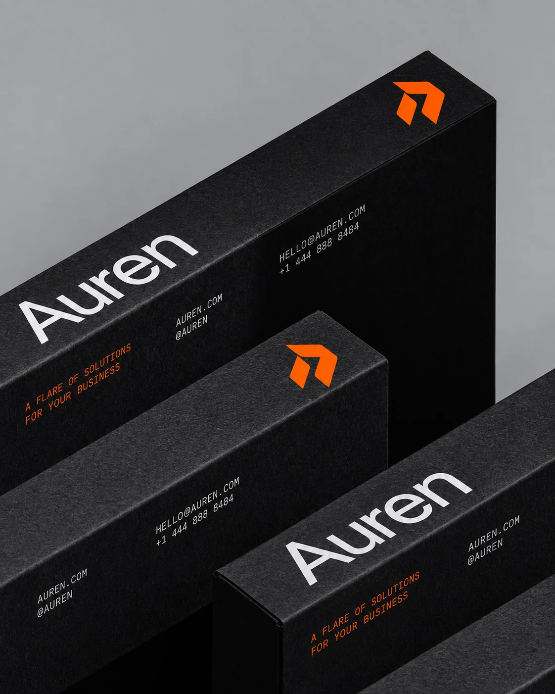
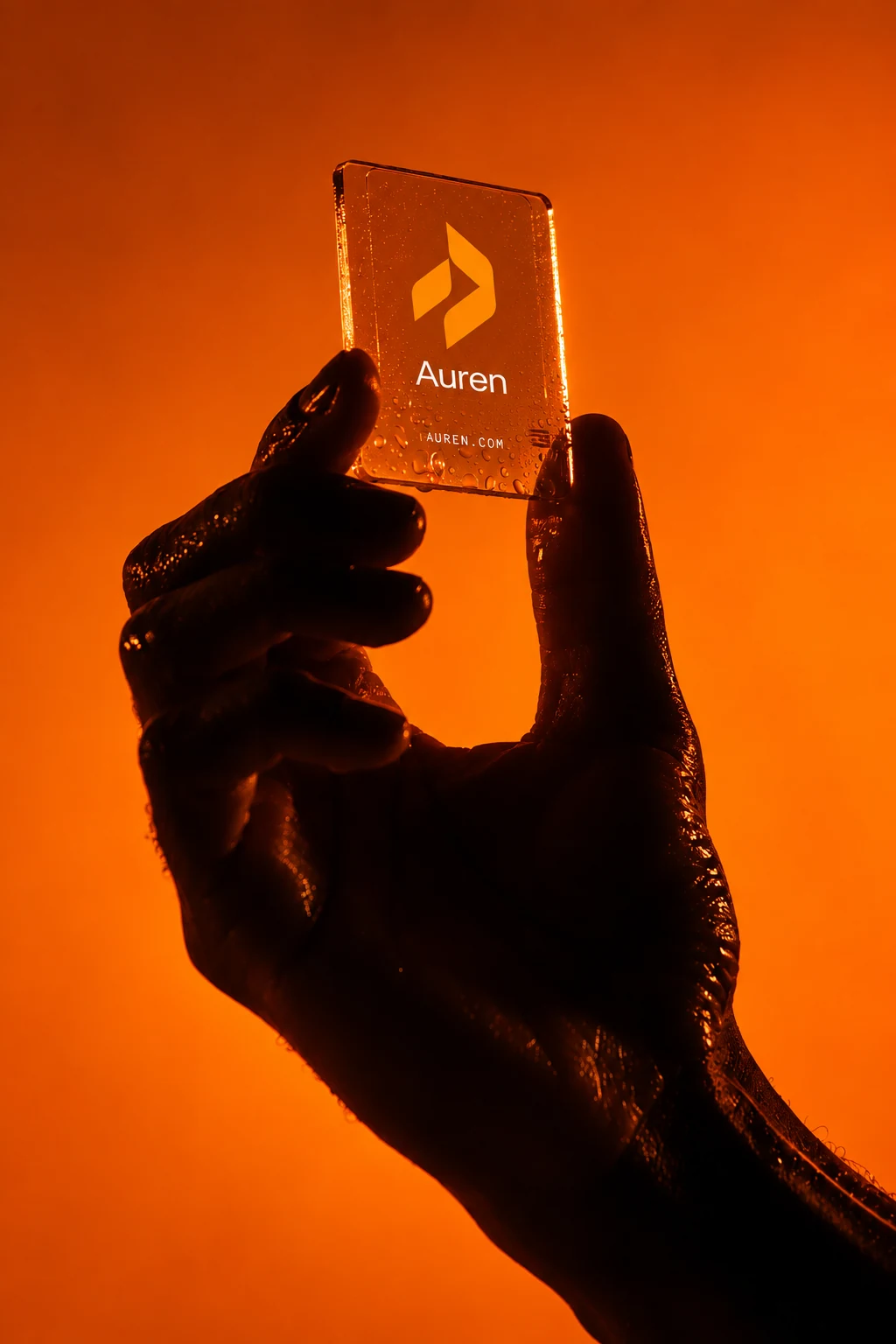
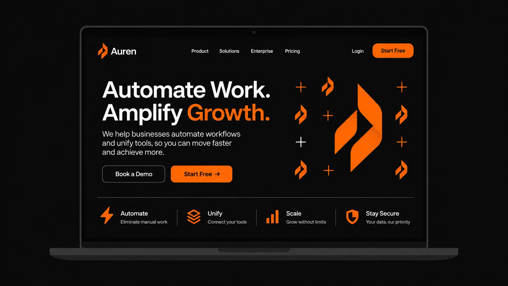
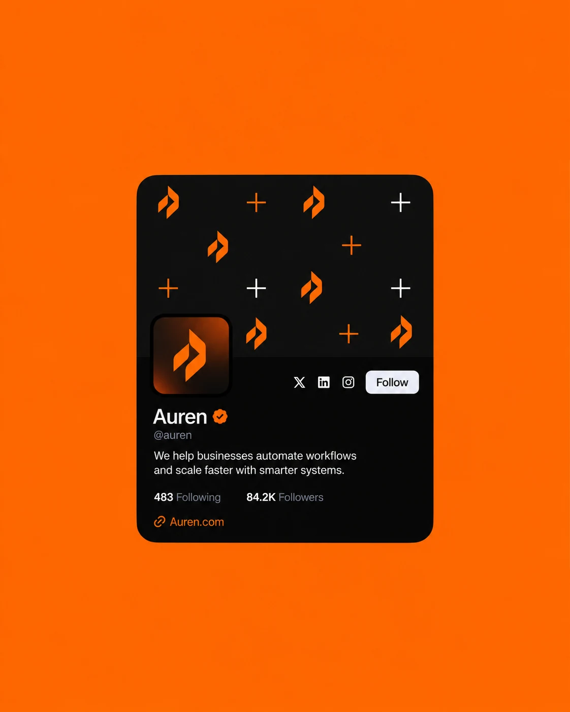
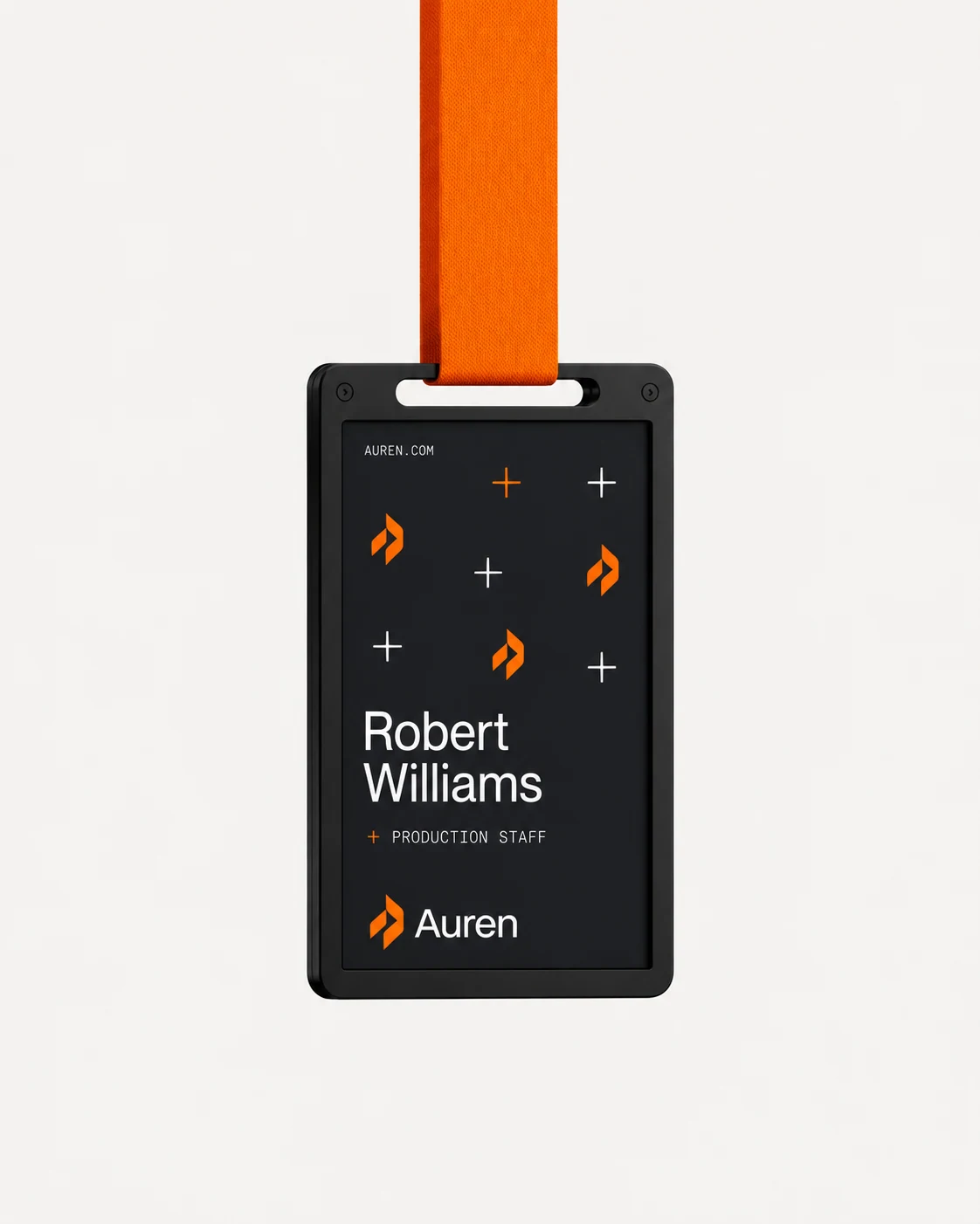
The system brings together orange, white and charcoal, a repeating pattern and a consistent typographic direction. Print, digital and physical spaces all share the same point of view.
01 The identity
A recognisable starting point.
02 Print & material
The details make the difference.
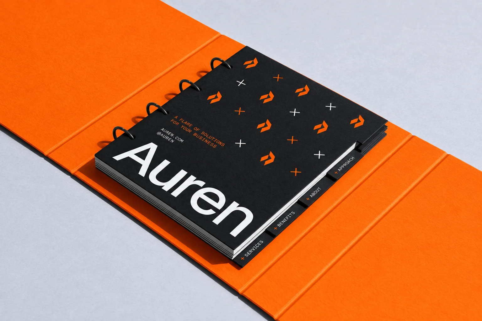
03 Digital & everyday
The same direction, everywhere.
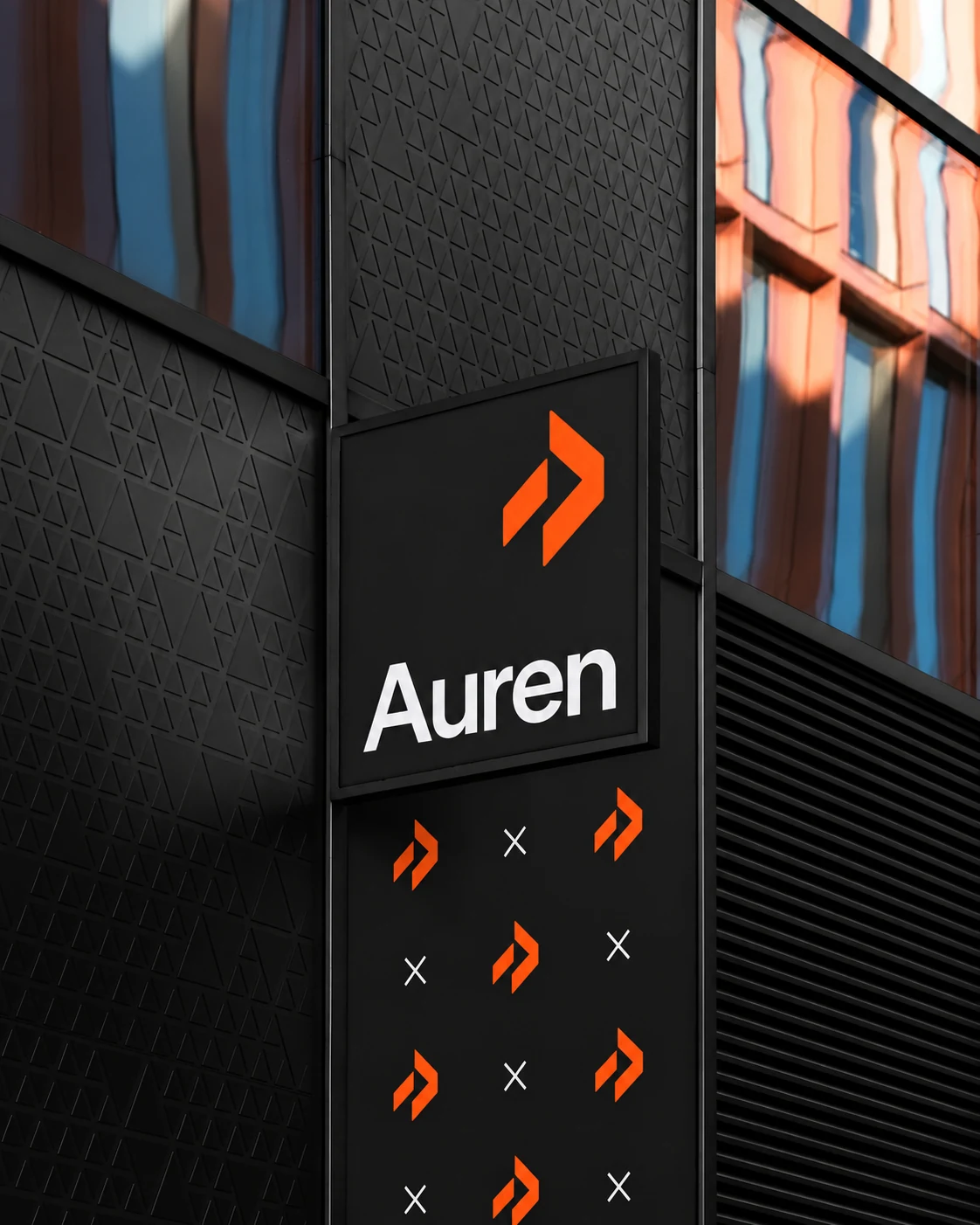
04 Out in the world
Built for more than a screen.